BRAND & EXPERIENCE DESIGN
Pickup
Timeline
8 months
Team Size
1 person (me)
Role
Brand Designer
Experience Designer
Tools




Overview
Pickup is a sports community platform that maps nearby courts and fields in real time, helps players find games, and builds the consistent local sports community that's hard to stumble into on your own. Drawing on my own experience of relocating from Texas to the Bay Area, I designed Pickup as a solution to information fragmentation that was both sports-specific and reliably current. What started as a brand identity grew into a full product, picking people up off their couches and into the world of recreational sports.
Problem
Recreational sports have real demand but no real infrastructure. Nationally, 24% of U.S. adults say they're at least somewhat likely to join a recreational sports league, and 21% say they used to play team sports but no longer do. This represents a large gap between wanting to play and actually playing. [Sources: CivicScience, eMarketer]
If you talk to anyone who plays recreational pickup sports regularly, and the same few problems come up:
Fragmentation
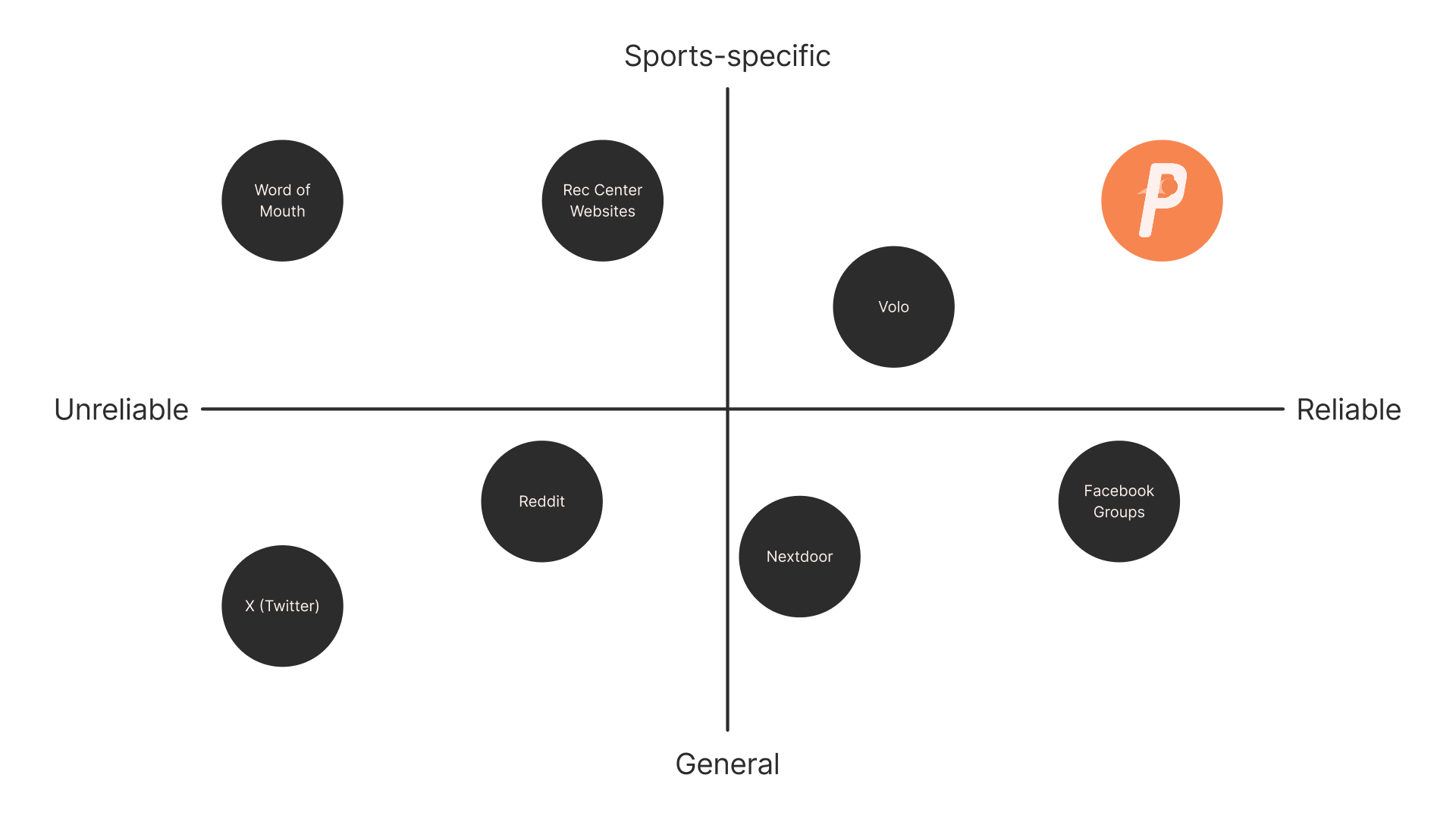
Information is scattered across several platforms like Facebook groups, Reddit, rec center websites, and more. There isn't one clear place to find games.
Unreliability
The information that does exist is unreliable. When you go to your local court or field, sometimes games happen, sometimes they don't, and you don't know until you show up.
Disconnection
Inconsistent play makes it hard to form communities. People lose the camaraderie and routine that keep them engaged and foster social connection.
High Barriers
Current solutions, like Volo, require a high commitment level, a high price tag, high competition, or some combination of all three.
Research
Early research looked at how people currently find games, and the pattern was clear: every existing channel was repurposed for this, not built for it. Nothing gave athletes a reliable, sport-specific way to see who was playing, where, and right now.
Ideation
From the beginning of the project, the name Pickup always stood out to me. It's the actual term players use for casual games, so the name does double duty as both brand and category descriptor
I had initially tried Montserrat/Inter and Poppins/DM Sans for the typeface, as I wanted a pairing that was minimalist and readable. In other words, I tried to play it safe. Shortly after, I received feedback from a couple of experts that neither pairing was connecting with the brand's philosophy, and I was encouraged to dive deeper into that. I then settled on a bolder, more athletic combination: Rift Soft (Bold Italic for headlines, Demi Italic for subheads) paired with National Park Light for body copy. Rift Soft was a hit on my end, as its Bold Italic and Demi Italic variations reminded me of court lines and sports jersey typography.
The logo went through several rounds of exploration: different ball icons, different comet-trail arcs, and different treatments of the “P” as a standalone mark. I had trouble finding a solution that was as unique or memorable as I wanted it to be. Some details would get lost, or the sports aspect would be unclear.
The Identity
For the final system, I landed on a bold, condensed wordmark in dark charcoal (inspired by the blacktop courts I grew up playing on) and a bright orange (inspired by the sport that started it all: basketball), with a light peach and off-white supporting palette.
The secondary logo works as a standalone icon for contexts where the wordmark might get lost. I also experimented with alternate sport-themed color variants based on a user's primary sport, emphasizing the flexibility that the product has
I also wanted to incorporate a physical product for our users, so I designed “Skillbands”. These are silicone wristbands that users can wear on and off the court, signifying their skill level. White is beginner, orange is intermediate, and black is advanced.
This inclusion — a physical wristband — turned out to be the seed of the entire product phase.
The Product
Once the identity was in place, the next question was obvious: what would this product actually do? The app was designed around the full arc of a single pickup session:
Before your session
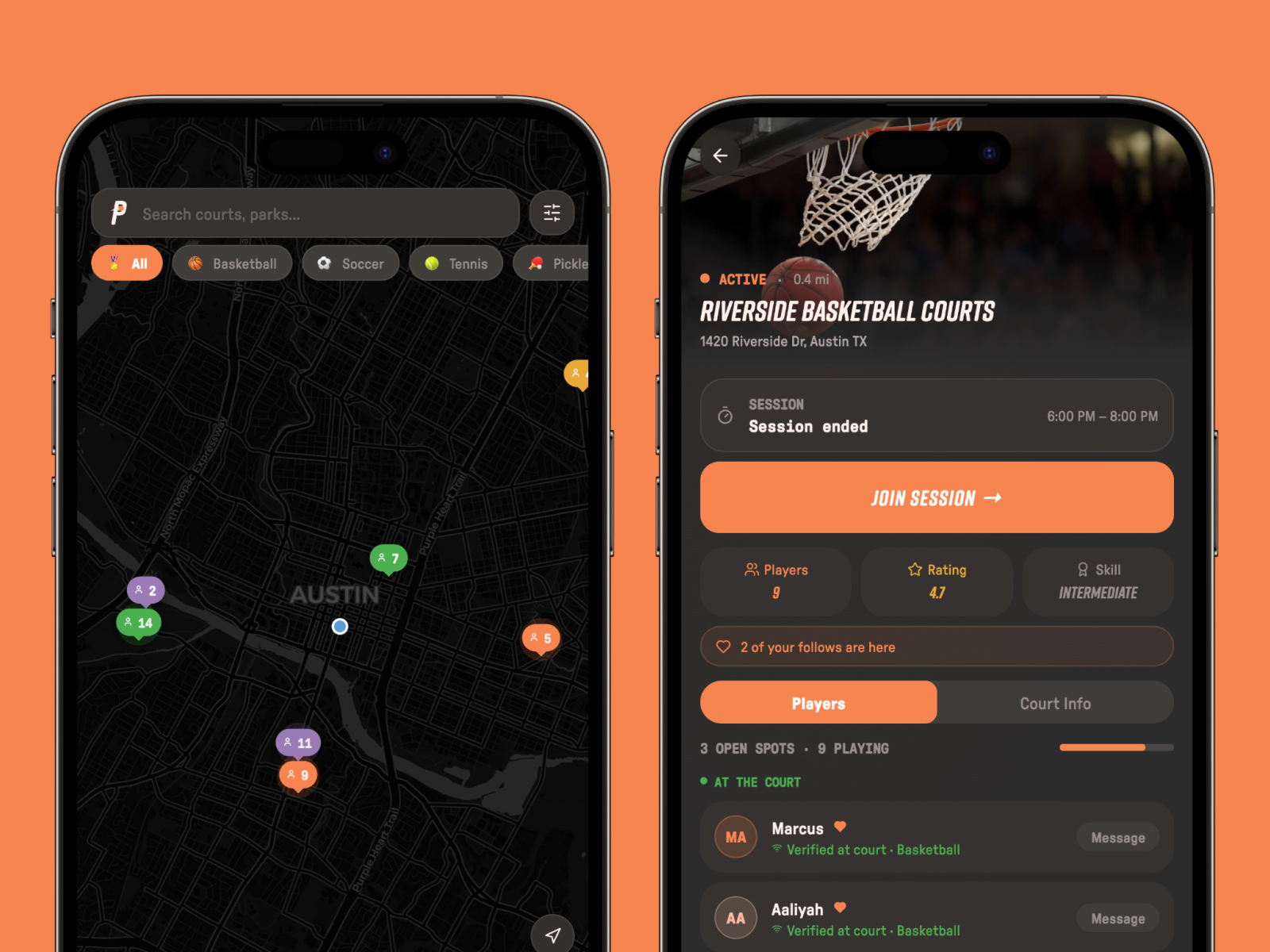
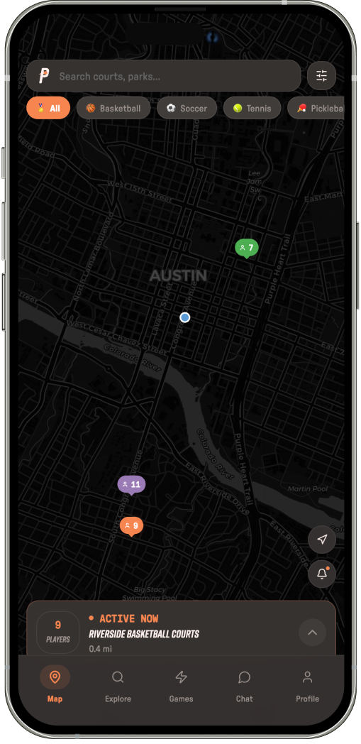
When opening the app, the user lands on the facility map. Each pin represents different facilities that have active Pickup hours at the moment. Every facility has an attendance counter for how many people are playing, as well as a color based on the sport being played. A persistent card at the bottom shows the nearest active facility for the user's primary sport.
When the user taps a pin, the facility's profile page will show, where they can see other users they know who are currently there or are joining later. They'll also be able to see some general information about when the Pickup hours are, what the general skill level is, and so on.
The “Bring Your Squad” feature lets you invite friends to a session directly from a facility page.
During your session
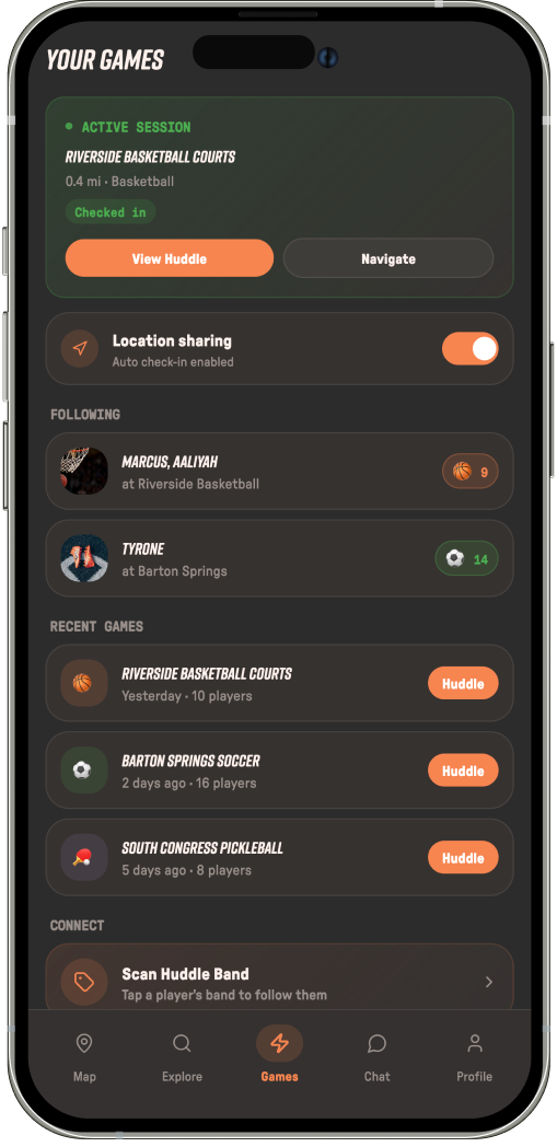
Pickup will automatically check the user in and out of a session via their phone's location services. This creates a more reliable method for other users to see how many people are playing at a specific location. Users can also choose to turn off location sharing entirely.
After your session
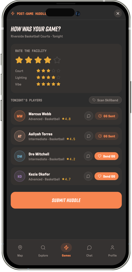
After the user completes their session, they will be sent a “Post-Game Huddle,” where they can rate the facility, rate the sportsmanship of other players, or send kudos.
In this phase of the project, my Skillbands concept evolved. They became Huddlebands: NFC-enabled wristbands that let players tap to connect and pull up each other's profiles instantly. This turned what was initially a piece of physical brand merchandise into a core functional feature of the product
Testing and Feedback
Method
After creating my first prototype for Pickup, I ran moderated usability sessions with 4 testers, each role-playing a persona (Jordan Davis, a former high school basketball player living in Austin who plays casually on weekends) rather than using the app as themselves. Testers thought out loud while completing two tasks:
Find a court nearby on the smart map and reserve a spot at the current session.
Complete and submit the post-game huddle from a previous session.
What I Learned
- “Play Here” was ambiguous. Testers weren't sure whether tapping it booked a physical court, joined an existing group, or committed them to a specific time window — a core action needed to communicate what it actually does.
- Testers wanted to know whether player counts reflected people currently at the court versus people who'd only said they were coming, to avoid showing up to an empty court on a “false positive.”
- The Post-Game Huddle was too buried. It felt like a secondary profile feature rather than a natural last step in the session flow it's meant to close out.
- Testers wanted more social texture: rating other players on sportsmanship (not just rating the facility), group messaging, more visible distance/proximity data, and a “bring your squad” flow that's easier to find.
- One sport doesn't fit all. Testers pointed out that high-occupancy team sports like soccer need different coordination and social features than lower-occupancy, more solitary sports like tennis — a one-size-fits-all flow won't hold up across sport types.
Reflections
My biggest takeaway from this project is not to be too attached to the idea of something. Throughout the project, I was so passionate about the idea behind Pickup, and I had spent so much time working on it in both phases. I found myself to be reluctant to make any changes to the core concept, even when the answer was right in front of me. Slowly, with help from my mentors and peers, my mindset shifted from “I'm subtracting from my idea” to “this project is evolving into something better.” This project really pushed me to be a more open-minded designer.
Starting Pickup as a brand project and carrying it into an experience design over two semesters felt like a marathon: long and difficult but satisfying in the end. The brand design phase pushed me to think about what Pickup feels like, before product design pushed me to zoom in on how it would work with real constraints. I found that both are important, but they need to work hand in hand to create a cohesive result.
None of this would've happened without the people who pushed me along the way.
Acknowledgements
Thank you, Josh, for believing in me since day one and for your guidance throughout my design journey. And thank you, Elena, for constantly encouraging me to push the boundaries of what I thought was possible.