PRODUCT DESIGN
Verde
Timeline
6 weeks
Team Size
2 people
Role
Product Designer
User Researcher
Tools


Overview
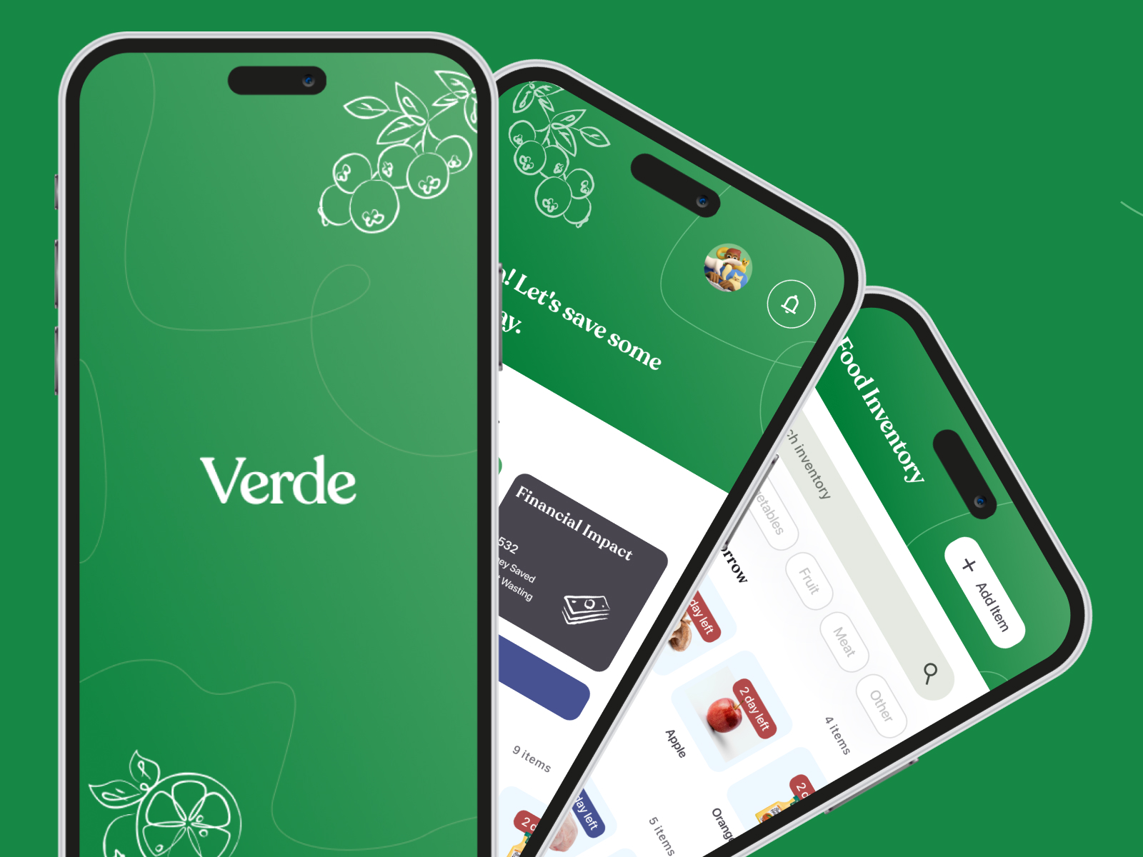
Verde is a mobile app designed to help people reduce food waste by making it effortless to track what's in their kitchen and act on it before things go bad. It provides a solution that combines expiration tracking and AI-powered meal suggestions into a single, low-friction experience. Verde reframes sustainable eating not as a sacrifice but as something worth celebrating.
Problem
Food waste is very expensive and common at home. When people lose track of what they bought or when it expires, they end up overspending on takeout, throwing away good food, and adding to larger waste and emissions problems.
How might we help people save money and reduce waste by keeping better track of their food's freshness?
Research
Before committing to a direction, we looked at how existing tools were already trying to solve this:

AI-powered inventory recognition and integrated meal planning
Expensive and limited to the fridge environment
Extensive sustainability data and analytics
Lacks direct connection to the user's own purchase and expiration management
Low-cost and accessible
Offers limited data beyond basic product information
Here, we saw an opening: no one was connecting the full loop of purchase, use, and next purchase in one place.
Ideation
We started with smart NFC tags applied to groceries at checkout. This idea actually came from my love of sneaker collecting. Second-hand sneaker marketplaces like StockX and GOAT attach NFC tags to their shoes to verify authenticity, and I wondered if the same approach could verify freshness. We proposed that the tags be applied to groceries at checkout, but expert feedback exposed a hardware dependency we didn't control. Tags only worked for products that had them, and they had to be applied at the source to be trusted.
This reframed the problem: people didn't need better sensors, they needed a better system that met them at every step of the process. We pivoted towards an all-in-one app built on three principles: make input effortless (scan a receipt instead of tagging items), make trust visible (always show why, not just what), and make the payoff felt (surface money saved and waste avoided). The name Verde, which translates to green in Spanish, reflects that sustainability focus.
Solution
Each screen below carries out one of those three principles. My primary focus was the Impact page, inventory logging flow, and AI-generated grocery lists, shown in more depth below. My collaborator, Johanna, led onboarding, inventory, and the receipt-to-recipe flow.
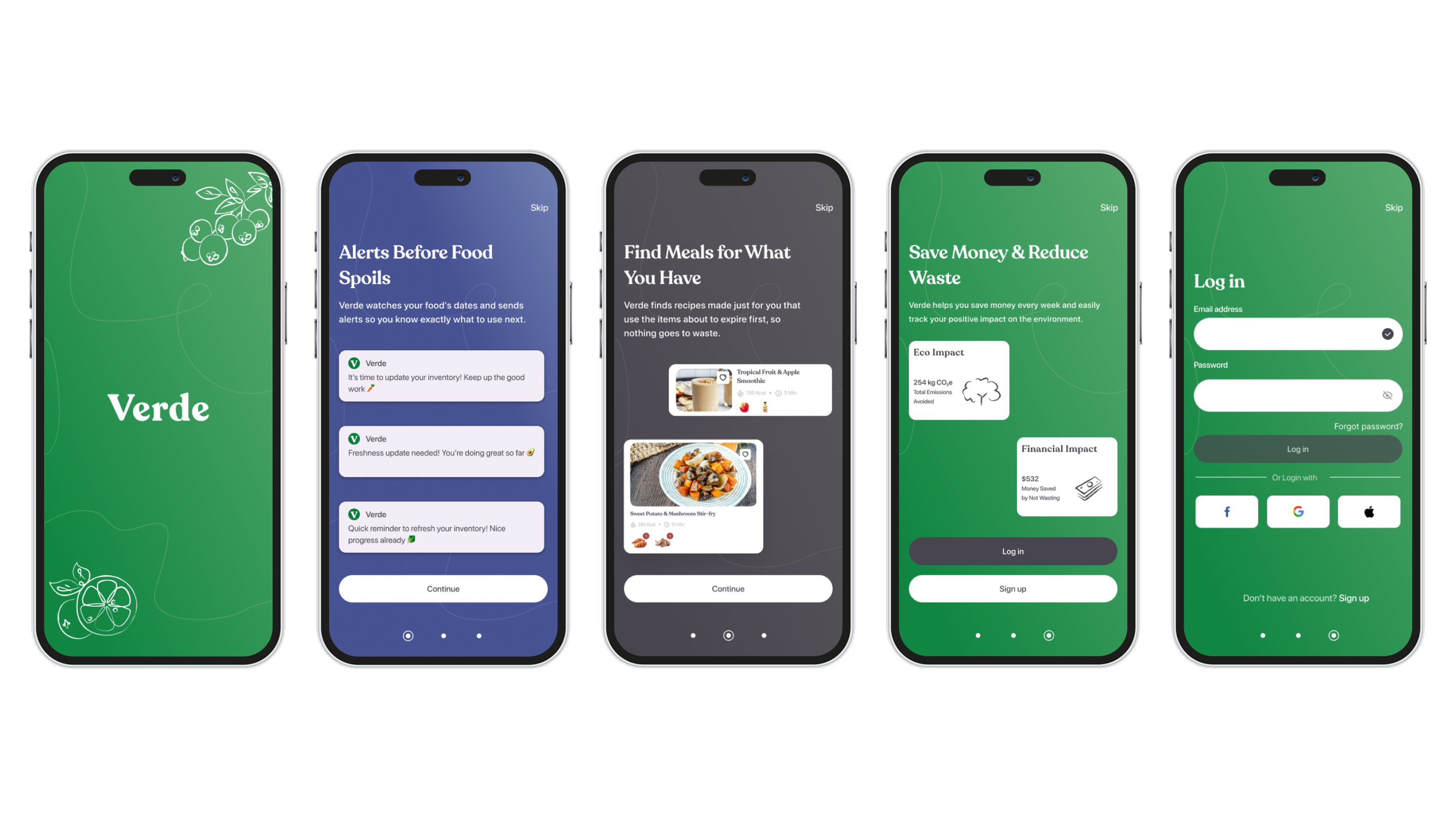
Onboarding — guided setup to personalize the experience
Testing & Feedback
We tested the prototype with five users, walking them through onboarding, adding items, and getting a meal suggestion. One participant put it simply: “it's pretty easy to progress through all the different steps and get a feel for things.”
4/5
described the interface as intuitive
3/5
praised the visual design
2/5
singled out Smart Receipt scanning as a highlight
Beyond usability, the feedback suggested the emotional angle was working too. Another tester noted it was “kind of cool” to see how a small habit change could ripple out to the communities they are a part of.
However, testing also surfaced real gaps:
2/5
questioned expiration date extraction from receipts
3/5
struggled to find the Impact page
Users also wanted the Recipe Generator to account for their actual context, like the kitchen appliances they have or dietary needs, instead of working off expiration dates alone. With more time, our next steps would be adding filters for those constraints, clarifying date calculations right after a scan, moving Impact into primary navigation, and adding a verification step after receipt scans.
Reflections
Working on Verde taught me as much about collaboration as it did about design. Working in a two-person team under a tight timeline meant wearing more hats than I typically do. In the end, this reinforced a lesson I'll carry forward: catching a problem mid-project and pivoting (like we did when we dropped the Smart Tags idea) is much better than pushing through with something you already think is wrong. It also sharpened how I think about transparency when designing with AI, and how much existing tools and design systems can accelerate a prototype when time is tight.
Acknowledgements
Huge thanks to Johanna, my collaborator on this project, and to Pia for the space to explore and refine our idea!